1. Basic Components
The following are commonly used components when creating graphs with matplotlib:
- Figure: Represents the entire graph canvas-like object.
- Axes: Represents the drawing area of the graph. Multiple Axes can be placed within a Figure.
- Plot: The actual objects being drawn, such as lines, points, and bars.
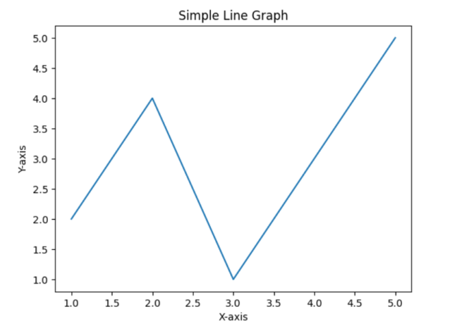
2. Creating a Simple Line Graph
Let’s create a simple line graph as the most basic example:
import matplotlib.pyplot as plt

# Prepare data
x = [1, 2, 3, 4, 5]
y = [2, 4, 1, 3, 5]

# Create Figure and Axes objects
fig, ax = plt.subplots()
# fig: the entire Figure object, ax: the Axes object for the drawing area

# Create the plot
ax.plot(x, y)

# Set title and axis labels
ax.set_title("Simple Line Graph")
ax.set_xlabel("X-axis")
ax.set_ylabel("Y-axis")

# Display the graph
plt.show()
3. Creating Various Types of Graphs
Matplotlib can create various types of graphs. Here are some examples:
- Scatter plot: ax.scatter(x, y)
- Bar chart: ax.bar(x, y)
- Histogram: ax.hist(data)
- Pie chart: plt.pie(sizes)
import matplotlib.pyplot as plt
import numpy as np

# Scatter plot
fig, ax = plt.subplots()
x = np.random.rand(50)
y = np.random.rand(50)
ax.scatter(x, y)
plt.show()
# Bar chart
fig, ax = plt.subplots()
categories = ['A', 'B', 'C', 'D']
values = [20, 35, 30, 15]
ax.bar(categories, values)
plt.show()
# Histogram
fig, ax = plt.subplots()
data = np.random.randn(1000)  # Random numbers following a standard normal distribution
ax.hist(data, bins=30) # bins: specifies the number of bars
plt.show()
# Pie chart
fig, ax = plt.subplots()
sizes = [15, 30, 45, 10]
labels = ['A', 'B', 'C', 'D']
plt.pie(sizes, labels=labels)
plt.show()
4. Customizing Graphs
Matplotlib allows you to customize various elements of the graph, such as color, line style, markers, and font size.
- Change color: ax.plot(x, y, color=’red’)
- Change line style: ax.plot(x, y, linestyle=’–‘)
- Add marker: ax.plot(x, y, marker=’o’)
- Change font size: ax.set_title(“Title”, fontsize=16)
- Display grid lines: ax.grid(True)
- Display legend: ax.legend([‘Data 1’, ‘Data 2’])
import matplotlib.pyplot as plt

x = [1, 2, 3, 4, 5]
y1 = [2, 4, 1, 3, 5]
y2 = [3, 1, 4, 2, 6]

fig, ax = plt.subplots()

ax.plot(x, y1, color='blue', linestyle='-', marker='o', label='Data 1')
ax.plot(x, y2, color='red', linestyle='--', marker='x', label='Data 2')

ax.set_title("Customized Line Graph", fontsize=16)
ax.set_xlabel("X-axis")
ax.set_ylabel("Y-axis")
ax.grid(True)
ax.legend()

plt.show()
5. Placing Multiple Graphs in One Figure
Using plt.subplots() allows you to place multiple Axes objects within a single Figure.
import matplotlib.pyplot as plt

x = [1, 2, 3, 4, 5]
y1 = [2, 4, 1, 3, 5]
y2 = [3, 1, 4, 2, 6]

fig, (ax1, ax2) = plt.subplots(1, 2)  # Create Axes in 1 row and 2 columns

ax1.plot(x, y1)
ax1.set_title("Graph 1")

ax2.scatter(x, y2)
ax2.set_title("Graph 2")

plt.show()
6. Saving Graphs to a File
You can use plt.savefig() to save the created graph as an image file.
import matplotlib.pyplot as plt
x = [1, 2, 3, 4, 5]
y = [2, 4, 1, 3, 5]
fig, ax = plt.subplots()
ax.plot(x, y)
ax.set_title(“Simple Line Graph”)
plt.savefig(“line_graph.png”) # Save as PNG format
# Other formats: PDF, SVG, JPG, etc.